This is a great chart we saw in the FT.
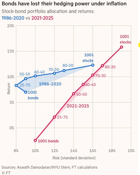
From the article:
“For decades, the 60-40 stock and bond portfolio — or something close to it — allocation model was the universal standard: capture growth with equities and offset risk with bonds…
…But since 2021, with the return of high inflation, bonds are less and less useful as a diversifier. Looking at the average risk and return across various stock/bond weightings (using annual returns for the S&P 500 and 10-year Treasury), not only has risk increased all across the board since 2021, but bond returns have been negative. In short, correlation between stocks and bonds has turned positive, meaning bonds have started contributing to equity losses, instead of offsetting them.”
Most are familiar with the efficient frontier concept. A 45 degree line is not what you want to see, all that’s happening there is a drop in portfolio standard deviation coming from a reduction in the asset that’s doing well. Through the first 20 years of this century, bonds ran at steadily negative correlations, particularly during periods when the economy and stocks struggled. The negative correlations weren’t a statistical quirk, they were a reflection of the Fed’s dual mandate on inflation and unemployment. With inflation largely benign through this period, the Fed was able to ease when the economy or stock market swooned.
Monetary policy operated to lower borrowing costs in order to boost the economy and soothe stock market fears.
Fast forward to the 2021 to present period in the chart. Bonds started the period at ~90bps (US10y) with a Fed rate of 25bps. Inflation came roaring back, driven by uneven pandemic responses meeting rolling supply/demand shocks, easy central banks, loose fiscal policy and then war driven commodity shocks. Bonds fell, correlations turned positive and central banks the world over are in a much tougher spot. Many have single mandates on inflation. Portfolios that relied on bonds as the diversifier have seen the character change.
Back to portfolio math. The ideal asset for a portfolio optimizer runs at around the same level of risk and return as the base asset (for most, stocks) and has negative correlation. We rebuilt the chart across two panels (with slightly later start dates, see footnote) and added the MLM Index and the realized inflation rate. To recap briefly, the MLM Index gives systematic long and short exposure to fixed income, currency and commodity markets through long term trend following. Long if a market is going up, short if it’s going down. We’ve been calculating and implementing it since the 1980s.

How we interpret. In the first period, the MLM Index looks more useful than bonds primarily as it runs at a level of volatility closer to that of stocks. The primary issue with bonds in this period is less the return (although obviously higher returns better!) than the fact that bonds structurally run at lower levels of volatility than stocks, driven by the relative risk characteristics of the two. Both bonds and the MLM Index keep the low/negative correlation trait, with the Index also returning more. Higher return, similar correlation profile, higher level of volatility made for a compelling portfolio addition. Core PCE inflation was at 2%.
The second period has Core PCE inflation close to 4%. Bonds are still lower volatility but see returns move negative, and the correlation to stocks has flipped positive. The MLM Index kept running at a volatility level close to stocks, had a positive return in the higher inflation environment, and maintained negative correlation to stocks. The MLM Index benefited from exposures directly in the areas inflation manifests in markets, namely long exposures in commodity markets and short exposures to fixed income, picking up rising yields. Portfolio combinations that include the MLM Index see higher returns and lower standard deviation.
We wrote in notes at the turn of the decade on how decades rarely look alike. The end of the 1970s saw interest rates and inflation at 15%, with stock market multiples a little over 7 (as well as an Iran crisis). Things were pretty different by 1990. The end of 1999 saw peak internet bubble euphoria and fears the US wouldn’t have a bond market as then Fed chair Greenspan was telling Congress that the goal of paying off the federal debt completely was in reach a decade forward, and the CBO was projecting a world where we would have fiscal surpluses well past 2030 (lol). The end of 2009 clearly looked a ways different; in the depths of the GFC, back to trough equity multiples after stocks went largely nowhere for a decade, and large deficits. 2019 capped a decade of very strong equity markets, the biggest macroeconomic uncertainty being ultra low inflation and escaping the zero lower bound. It didn’t take long for that to change.
Long term asset allocations are meant to be just that – long term and slower moving. But at the same time the world changes and portfolios need to have some adaptability built in. Trend following commodities, fixed income and currency markets helps with that adaptability, shifting exposures some, in our view leading to more robust portfolios. What does the world look like going forward? Does it look like a stable world given the geopolitical shifts we are seeing? The shifts in AI, tech and robotics? The deficit spending? The supply shocks? And if it does – trend following will adapt. If inflation is benign and bonds do great from here as we go back to steady 2%, trend can be long. Same with commodities – the short side is valuable too, as we wrote here.
Footnote: Data from Mount Lucas is a combination of the MLM Index from 1988 through 1991 and the MLM Index EV from 1992 through December 2025. Data from NYU Stern School Stocks (Large Cap) and US T.Bond from 1988 through December 2025.
You must be logged in to post a comment.